As a designer, choosing the right font for a project can be crucial for creating a visually appealing and professional result. This is especially true for catalogue design, where the font choice can greatly impact readability and the overall aesthetic of the piece. In this blog, we will explore the different types of fonts and the key factors to consider when selecting a font for a catalogue design.
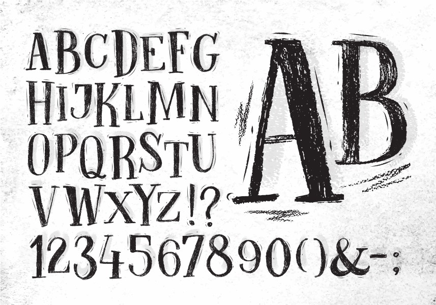
Types of Fonts
- Serif Fonts: Serif fonts are characterized by small lines or strokes at the end of each letter. These fonts are commonly used in printed materials, such as books and magazines, and are considered traditional and elegant. Examples of serif fonts include Times New Roman, Georgia, and Garamond.
- Sans-Serif Fonts: Sans-serif fonts do not have the small lines or strokes at the end of each letter, giving them a more modern and clean appearance. These fonts are commonly used in digital media, such as websites and apps. Examples of sans-serif fonts include Arial, Verdana, and Calibri.
- Display Fonts: Display fonts are designed specifically for use in headlines and titles, and are often more decorative and unique than other font types. Examples of display fonts include Impact, Brush Script, and Bangers.
- Script Fonts: Script fonts mimic handwriting and calligraphy, and are often used for invitations, greeting cards, and other formal documents. Examples of script fonts include Lucida Handwriting, Pacifico, and Great Vibes.
Factors to Consider When Selecting a Font
- Readability: When selecting a font for a catalogue, readability should be a top priority. The font should be clear and easy to read, even when printed in smaller sizes. Sans-serif fonts are generally more legible than serif fonts when used for digital materials, while serif fonts are better for printed materials.
- Brand Identity: The font you choose should align with the brand’s identity and values. If the brand is traditional and elegant, a serif font may be a good choice, while a modern and clean brand may benefit from a sans-serif font.
- Context: Consider the context in which the catalogue will be used. A catalogue for a children’s toy store may benefit from a fun and playful font, while a catalogue for a luxury jewelry brand may need a more sophisticated font.
- Hierarchy: In a catalogue, different levels of information, such as headings, subheadings, and body text, should be clearly distinguishable. This can be achieved through the use of different font styles and sizes, as well as other design elements, such as colour and spacing.
In conclusion, choosing the right font for a catalogue design is an important step in creating a professional and visually appealing piece. Consider the type of font, readability, brand identity, context, and hierarchy when selecting a font for your next catalogue design.